OVERVIEW
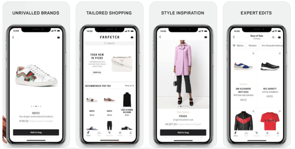
Three usability experts conducted an Unmoderated Remote User Test to evaluate the usability of Farfetch.com in order to identify navigation patterns, potential problems, and design opportunities. The usability experts worked collaboratively to come up with a scenario, a number of tasks, a pre-task questionnaire, and a post-task questionnaire for the usability test.
OBJECTIVE
Unmoderated remote test report
ITEM
Team project
IN CHARGE
Report design
TOOLS
Google Docs, UserTesting
PERIOD
Sep 2023 - Dec 2023
Brief of Testing Plan
Nine participants were recruited in total for this test and were asked to conduct the following steps.
Pre-test questionnaire
- What’s your age range?
- How frequently do you shop online?
- Where do you mainly shop online? (Open answer)
- What would be the reason that makes you prefer to purchase a product online? (Multiple answers)
- What factors do you consider when you want to do online shopping? (Multiple answers)
- What are the reasons you are willing to shop on a new website? (Multiple answers)
Scenario
The winter season is coming, you want to shop on a fashion website to find some nice outfits to participate in your friend’s birthday party next month.
Tasks
- Task 1: Find a pair of black leather ankle boots for your winter collection.
- Task 2: Find the product (Cherry print sweatshirt from Gucci, Size M) and add it to your wishlist.
- Task 3: Navigate to your shopping cart, add a product from your wishlist to your cart, and proceed to checkout.
- Task 4: Find out the return policy and see if you can return a product you received 15 days ago and how to do so.
Post-test questionnaire
- How easy was it to find what you were looking for on our website? (Rating scale 1-5, poor - excellent)
- Which feature(s) on the website was the most important or useful to you? (Multiple answers)
- How likely is it that you would recommend our website to a friend or colleague? (Rating scale 1-5, very likely)
- Do you have any other comments about how we can improve our website? (Open answer)
Findings and Recommendations
- Finding 1: Users are unaware of how to use keywords in the search bar.
- Recommendation: Create placeholder or example keywords for the Search Input.
- Finding 2: Inconvenient layout of the filter section.
- Recommendation: Redesign the filter layout.
- Finding 3: Inaccurate information placement on return policy.
- Recommendation: Reorganizing information placement & adding connections between sections.
Heuristic Evaluation Report
Evaluate ten usability heuristics & severity ratings of usability problems for Resy Website
OVERVIEW
To enhance the reservation process on the Resy website and offer seamless experiences for their users. Two usability experts conducted a heuristic evaluation that focuses on the three most essential features of the Resy website: search input and result, create a favorite list of restaurants, and the process of booking. For each scenario, the researchers evaluated the website with ten usability heuristics and four severity ratings established by the Nielsen Norman Group.
OBJECTIVE
Heuristic evaluation report
ITEM
Team project
TOOLS
Google Docs, Miro
PERIOD
Sep 2023 - Dec 2023
Brief of Testing Plan
- Two usability experts conducted a heuristic evaluation of the restaurant reservation service on the Resy website
- A facilitator conducted a brief demonstration of the following scenarios: search input and result, create a favorite list of restaurants, and the process of booking.
- During the twenty-minute evaluation, experts noted any usability issues they encountered and assigned a severity rating for each problem.
Scenarios
You are a new user who is using the Resy website for the first time. You have to book a new reservation at a Japanese restaurant because you want to invite your friend for dinner next weekend near West Village. You are trying to find a restaurant over four stars, but you have a budget which is under $$$. Open the website and perform the following tasks:
- Search the restaurant near West Village.
- Add some restaurants to your hit list.
- Pick up a restaurant from your list.
Findings and Recommendations
Recommendation 1: Create Filters and Criteria for the Search Input
Recommendation 1 is intended to address two problems encountered during testing as following usability problems:
- Issue #2: Search for restaurants in the Search-bar. Users expect to input a keyword for criteria, such as location, price range, zip code.
- Issue #6: Expect the search bar to have filters to narrow down searching, such as specifying my location, cuisine, etc.
At present design, the Resy website does not show the placeholder or hints for the input criteria. Also, users are unable to narrow down the search scope with filters.(Figure 1-1)

Figure 1-1: the search bar on the homepage
Both evaluators encountered obstacles to input searching keywords. They have no idea the search bar allows multiple keywords to refine the search result. Besides, both evaluators expected to use filters to create the criteria to converge the selected restaurants.
Recommendation 2: Refine Micro-Interaction for Interactive Feedback
Both evaluators pointed out the Resy website lacks interactive feedback. An appropriate micro-interaction can guide users on how to take the next step or make users notice the relevant information, especially when both users tried to add restaurants in their favorite list (Create fav list). Recommendation 2 is intended to solve two issues, including Issue #1, which evaluator #1 estimated as a “4 – Catastrophic” severity rating. The button of Create fav list associated with the following issues:
- Issue #1: Confused with adding restaurants to the favorite list. The heart shape icon is hard to understand and discover the feature.
- Issue #5: After checking a restaurant on the map, it is hard to find the corresponding one on the left without feedback.
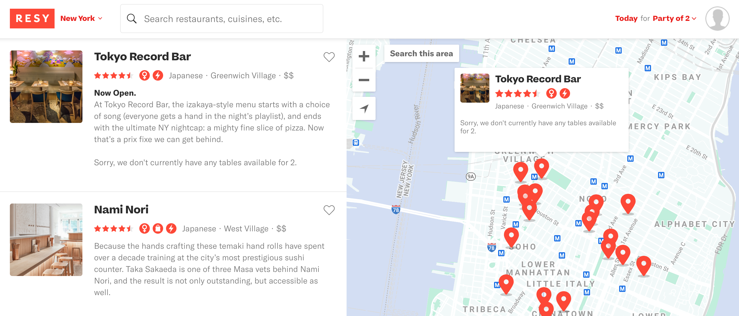
In Issue #1 example, the image below (Figure 2-1) shows that after evaluator #1 searched the keyword “Japanese” and wanted to add a restaurant to the favorite list. However, the small pop-up window in the map that distracted the user to discover the Create-fav-list button on the left side. Also, the image presents the problem of Issue #5. Evaluator #1 noted that having trouble without highlighting the corresponding restaurant on the left.

Figure 2-1: the small pop-up window in the map
Recommendation 3: Provide Relevant Information to Reduce Users’ Learning Time
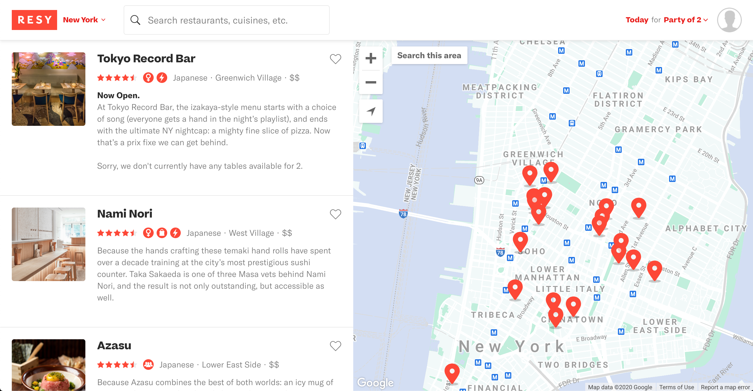
The recommendation 3 focuses on Issue #3. The search result presents related restaurants on a New York map. The map confused users who may not know the area in NYC. The search result should show the minimalist design instead of giving a map directly to confuse users. For example, making browser restaurants on a map as an optional feature that users can flexibly switch between the list and the map.

Figure 3-1: the New York map as the search result
Recommendation 4: Adapt Users’ Behavior with Considerate Interruptions
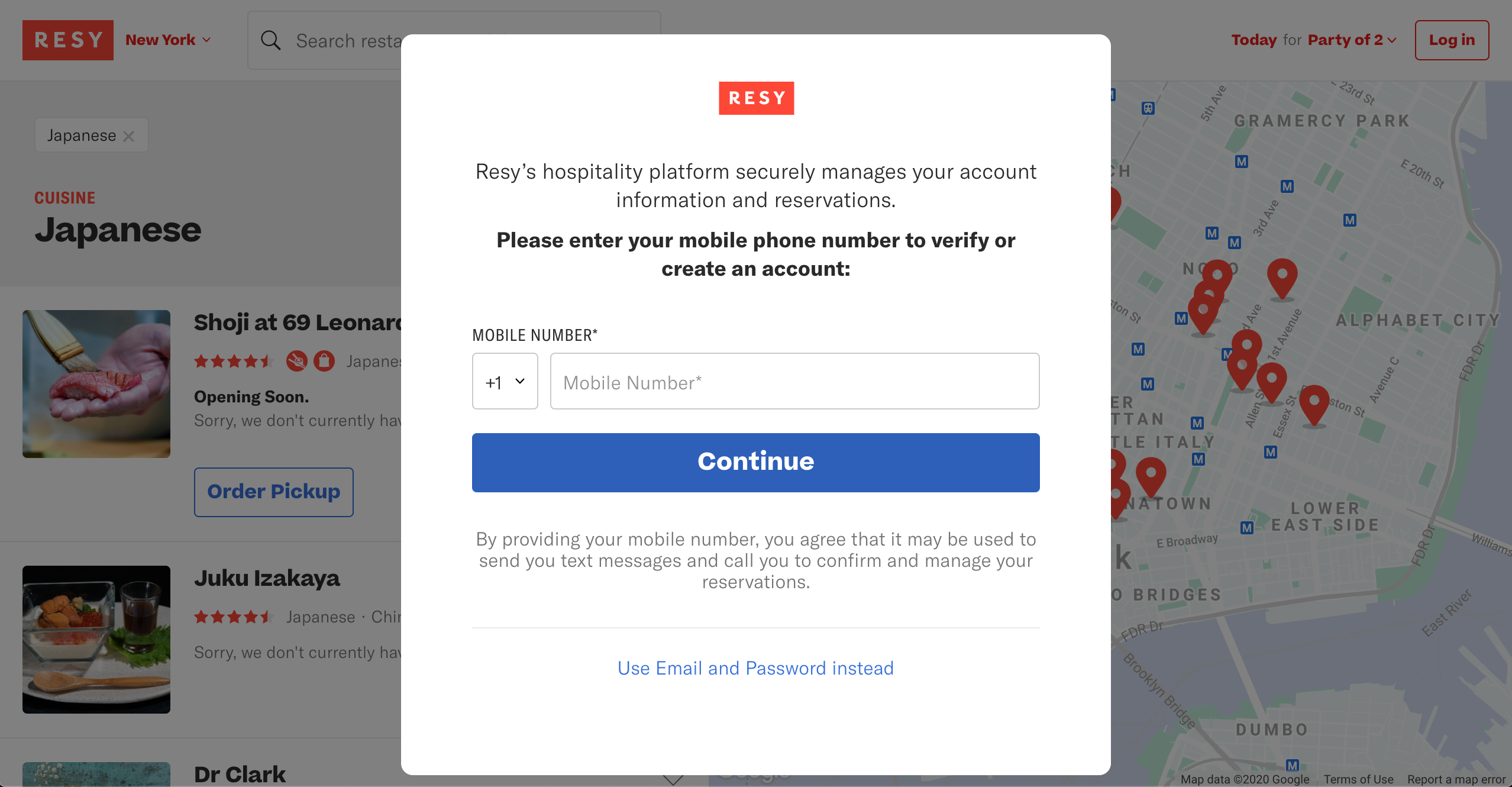
In Issue #4, two evaluators do not expect to register an account to access the hit list after clicking the heart icon. Both of them misunderstood the icon as a "like" feature: automatically add to the list without a login account (Figure 4-1).
Therefore, the improvement intends to avoid distraction and interruption. The design solutions have to consider how to deliver different mediums, which adapt to users and their behavior. For instance, the registration step should be placed after users finish creating a favorite list. The priority of the current task flows until users complete the process, then give another one if they are willing to move forward.

Figure 4-1: a registration window pops up after clicking the heart shape icon
Recommendation 5: Use Action-Packed Text for Call-to-Action Button
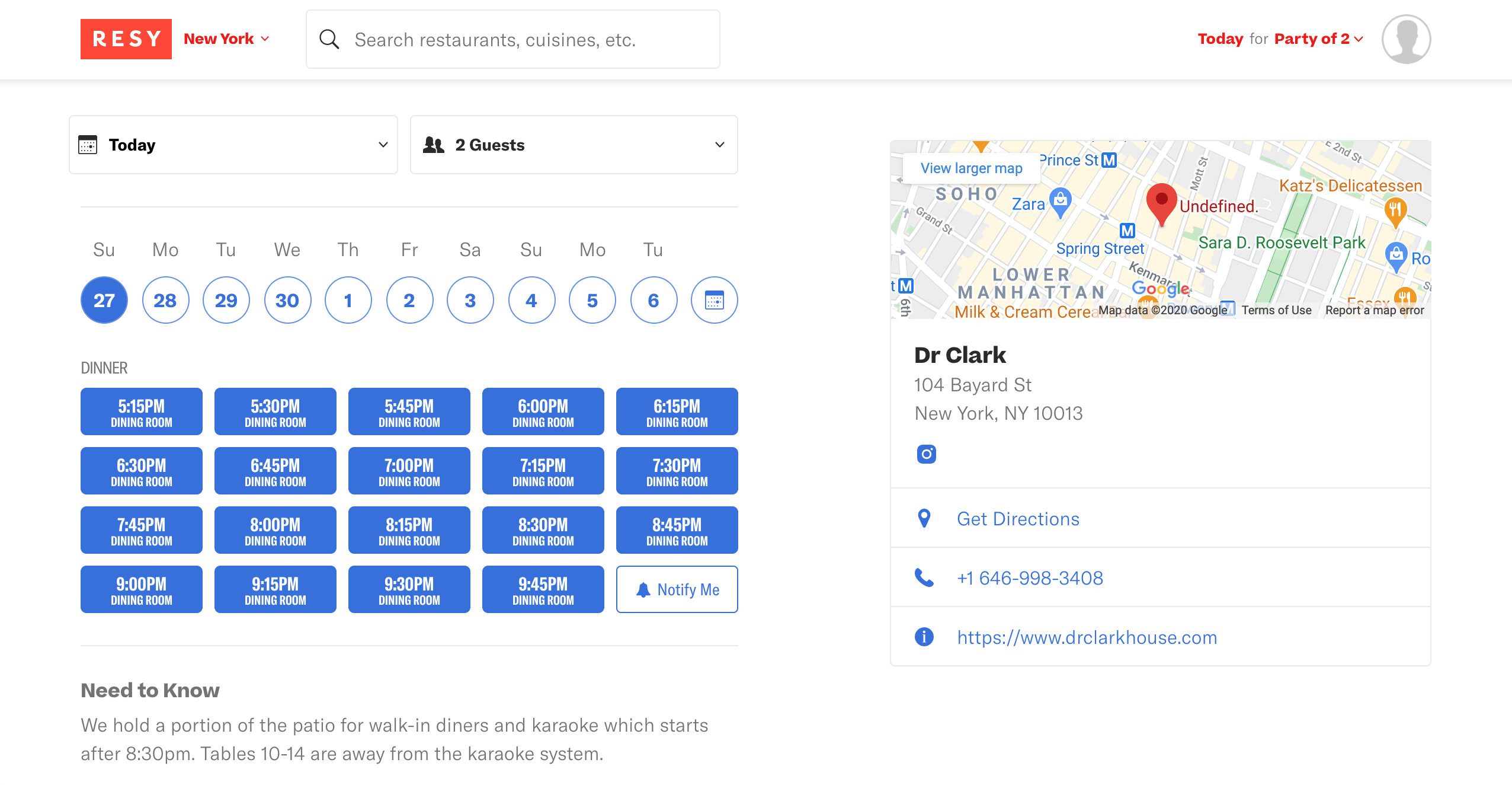
Finally, The last recommendation of this report addresses Issue #7. Evaluator #2 stated that the button is not clear enough to inform users how to create the booking action. The usability problem happens when the status of a button is not informed. Users have no idea about what is going on next (Figure 5-1, Figure 5-2).

Figure 5-1: unclear booking button

Figure 5-2: the page where to book a restaurant
To solve the issue, showing an action-packed text to describe a button. For example, change the present title “Dinner” into “Book A Table,” directly give a readable description that users know what’s buttons will do next after they click.
